
Data Viz: Population Growth Trajectories of U.S. Cities
Allen Sirolly / October 2, 2017
Earlier this year I wanted to learn more about the population growth rates of cities in the United States. I had read that cities were burgeoning again after a period of stagnation in the early- and mid-2000s, and I had seen evidence in the cities where I lived. But what I found online was mostly limited to tables and charts like this one which do little more than present static rankings over a fixed time period, and fail to convey the extent to which growth waxes and wanes over time. Unsatisfied, I went to Census.gov to explore the data myself. This necessitated a non-trivial amount of data munging, so I’ve decided to share my process below. The end result is this nice visualization which I hope to make interactive later. I also made a simple interactive version which can be viewed here.
The unit of analysis is an “incorporated place”, which comprises a legally bounded entity of varying size, including cities, boroughs, towns, and villages.1 The Census publishes “intercensal” population estimates for each of these places on an annual basis, with necessary revisions back to the most recent census year. The data can be retrieved via calls to the Census API.2
(The following code is available as a plain R script here.)
library(httr)
## Warning: package 'httr' was built under R version 3.4.2
library(purrr)
library(stringr)
library(data.table)
library(ggplot2)
library(ggrepel)
library(grid)
library(gridExtra)
# Grab data via the API
city00.16 = c(
GET(
# 2000 - 2009
url = paste0('https://api.census.gov/data/2000/pep/int_population?',
'get=POP,DATE,DATE_DESC,GEONAME,REGION',
'&for=place:*')
) %>%
content(),
GET(
# 2010 - 2016
url = paste0('https://api.census.gov/data/2016/pep/population?',
'get=POP,DATE,DATE_DESC,GEONAME,REGION',
'&for=place:*')
) %>%
content()
) %>%
map(setNames, unlist(.[[1]])) %>%
keep(function(x) grepl('estimate$', x$DATE_DESC)) %>%
rbindlist() %>%
setnames('GEONAME', 'City')
city00.16[, `:=`(
POP = as.integer(POP),
REGION = factor(REGION, labels=c('Northeast','Midwest','South','West')),
YEAR = as.integer(str_extract(DATE_DESC, '\\d{4}')),
STATE = c(state.abb, 'DC')[
match(str_extract(City, '(?<=, ).*$'),
c(state.name, 'District of Columbia'))],
City = sub('( [a-z].*)?,.*', '', City),
DATE = NULL,
DATE_DESC = NULL)][
, `:=`(
City = paste0(City, ', ', STATE),
STATE = NULL)]print(city00.16)
## POP City REGION state place YEAR
## 1: 2985 Abbeville, AL South 01 00124 2000
## 2: 2941 Abbeville, AL South 01 00124 2001
## 3: 2909 Abbeville, AL South 01 00124 2002
## 4: 2882 Abbeville, AL South 01 00124 2003
## 5: 2857 Abbeville, AL South 01 00124 2004
## ---
## 331726: 155 Yoder, WY West 56 86665 2012
## 331727: 159 Yoder, WY West 56 86665 2013
## 331728: 162 Yoder, WY West 56 86665 2014
## 331729: 162 Yoder, WY West 56 86665 2015
## 331730: 159 Yoder, WY West 56 86665 2016Now that we’ve retrieved and organized the data, let’s first construct plot labels by computing each entity’s population ranking—within its Census region3 as well as overall—and appending an integer pair to its name. There are far too many entities, so let’s also restrict the sample to places with at least at least some number of residents (this way we can honestly call them “cities”) and with estimates in every year of the sample period. The four Census regions don’t produce a very equitable distribution of cities for my chart, so I’ll set the cutoff to 250,000 for the Midwest, South, and West and relax it to 150,000 for the Northeast. Alternatively, one could group some mid-Atlantic states—DE, MD, DC, and possibly VA and WV—with those in the Northeast to create a bigger geography.
rekey = function(data) setkey(data, City, YEAR)
rekey(city00.16)
# Shorten names of consolidated cities
city00.16['Louisville/Jefferson County, KY', City:= 'Louisville, KY'] %>% rekey()
city00.16['Nashville-Davidson, TN', City:= 'Nashville, TN'] %>% rekey()
# Population size ranks & labels
city00.16[, sizeRank:= frank(-POP), by='YEAR'][
, sizeRank_region:= frank(-POP), by=.(YEAR, REGION)][
YEAR==2016, label:= paste0(City, ' (', sizeRank_region, ',', sizeRank, ')')]
city00.16 = city00.16[city00.16[
, .I[max(POP) > (if (REGION[1]=='Northeast') 1.5e5 else 2.5e5) & .N==17],
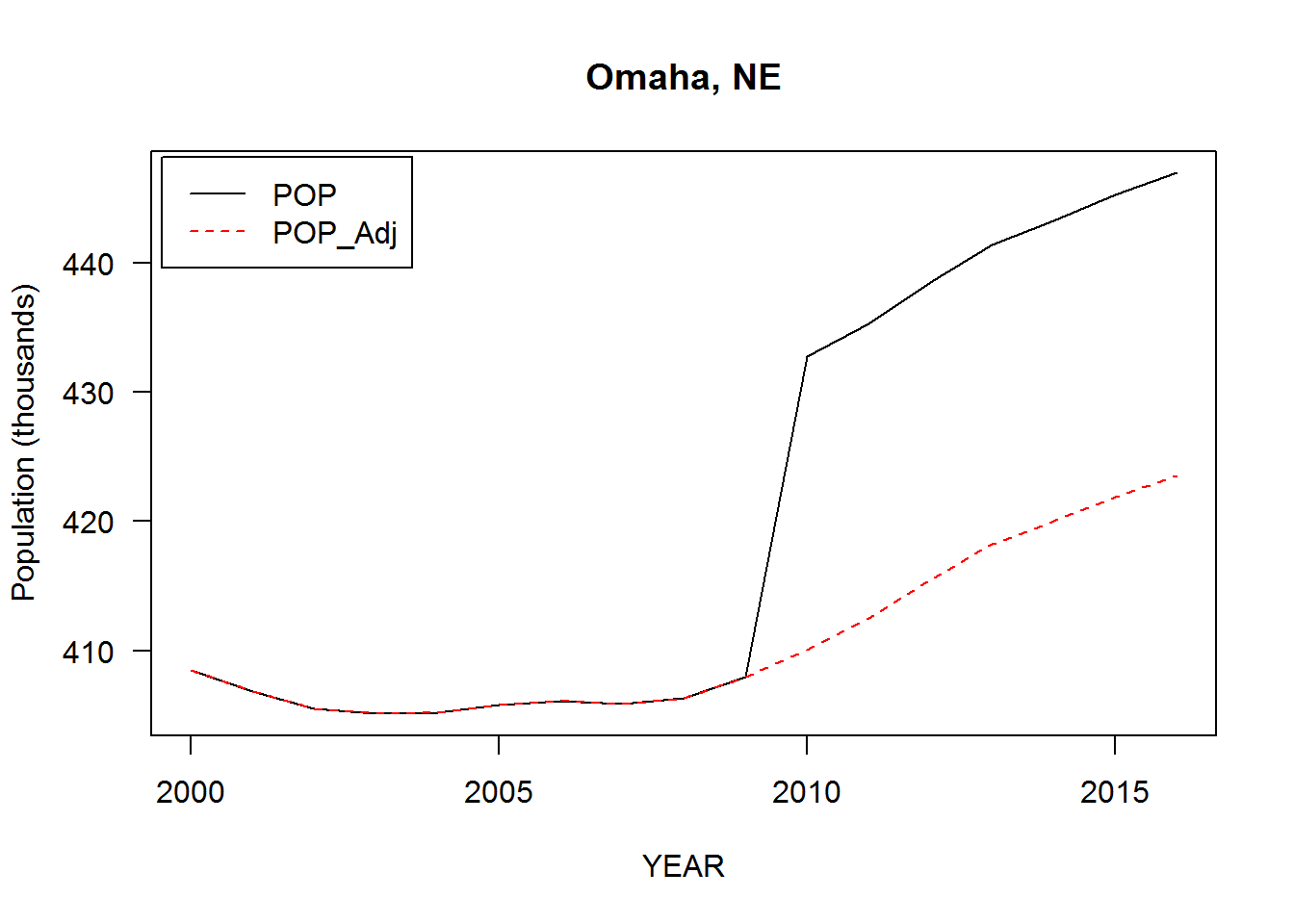
by='City']$V1]There are several sharp discontinuities in 2009-2010, maybe due to some place boundaries being redefined after the 2010 Census. As we’re ultimately interest in growth as opposed to levels, these discontinuities can be “corrected” by adjusting the population estimates. A reasonable adjustment is to assume the growth rate from 2009-2010 to be the average of growth rates from 2008-2009 and 2010-2011. If \(X_i\) is the population in year \(i\) and \(g_{i,j} = X_j / X_i - 1\) the population growth rate from year \(i\) to year \(j\), define the adjusted estimates \[ \tilde{X}_i = X_{2009} (1 + g_{2010, i}) \sqrt{(1 + g_{2008, 2009})(1 + g_{2010, 2011})} \\[1.2em] = X_i \frac{X_{2009}}{X_{2010}} \sqrt{\frac{X_{2009}}{X_{2008}} \cdot \frac{X_{2011}}{X_{2010}}} \] for \(i \geq 2010\) and \(\tilde{X}_i = X_i\) for \(i < 2010\). Doing it this way essentially joins the segments \(X_{2003:2009}\) and \(X_{2010:2016}\) while preserving growth rates within each. But bear in mind that some place definitions may not be consistent over the entire sample period.
Sanity check that it works:
adjust = function(x, i) {
  ifelse(i < 2010, x,
         x / x[i==2010] * x[i==2009] *
           sqrt(x[i==2009]/x[i==2008] * x[i==2011]/x[i==2010]))
}

city00.16[, POP_Adj:= adjust(POP, YEAR), by='City']

with(city00.16['Omaha, NE'], {
  matplot(YEAR, cbind(POP, POP_Adj)/1000, type='l', las=1,
          ylab='Population (thousands)', main=City[1])
  legend('topleft', c('POP', 'POP_Adj'), lty=1:2, col=c('black','red'),
         inset=.01)
})
Instead of calculating growth rates directly, let’s construct a population index, or trajectory, with base year 2002, \(\hat{X}_i = 100 \times \tilde{X}_i / X_{2002}\). Plotting the trajectories will give a nice visual representation of the data while permitting approximate comparisons of growth for different cities, or for the same city at different points in time. Let’s also compute the average trajectory of all cities in our sample to provide a baseline comparison. (Note that summing POP by year gives us a population-weighted average, as opposed to equal-weighted.)
baseYear = 2002

# Calculate population index (=100 in base year)
city00.16[, POP_Idx:= 100 * POP_Adj / POP_Adj[YEAR==baseYear], by='City']

city.Avg =
  city00.16[, .(City='City.Average', label='City.Average', POP_Adj=sum(POP_Adj)),
           keyby='YEAR'][
             , POP_Idx:= 100 * POP_Adj / POP_Adj[YEAR==baseYear]]

plotData =
  list(black = city00.16, red = city.Avg) %>%
  rbindlist(fill=TRUE, idcol='line_color') %>%
  `[`(YEAR >= baseYear) %>%
  rekey()
Finally, our plot will be more visually appealing with smooth curves that pass through a common point \((2002, 100)\). This can be achieved by fitting a polynomial regression (sans intercept) \[ popidx_j - 100 = \text{poly}(year_j - 2002, 5) \; \boldsymbol{\beta}_j + \boldsymbol{\varepsilon}_j \] for each city \(j\) and computing fitted values at sufficiently high resolution.4 I chose \(k = 5\) as the polynomial degree because it produces a good visual result without overfitting or underfitting the sample points. (I exclude New Orleans, LA due to a large population shock (-25%) in the aftermath of Hurricane Katrina in 2005. A piecewise smooth might be more appropriate for this exceptional case.)
plotData = plotData[!'New Orleans, LA']

xgrid = seq(baseYear, 2016, .1)

polyfit = plotData[, .(
  YEAR = xgrid,
  POP_Idx_fit = predict(
    lm(I(POP_Idx - 100) ~ 0 + poly(YEAR - baseYear, 5, raw=TRUE)),
    newdata=data.frame(YEAR=xgrid)) + 100
),
by=.(REGION, City, line_color)]

plotData = plotData[, .(YEAR=as.double(YEAR), POP_Idx, City, label)][
  polyfit, on=.(YEAR, City)]
One potential concern is the instability of polynomial fits near the endpoints, known as Runge’s phenomenon. This produces distortions in the slopes, making it ill-advised to try to extrapolate the trajectories into the future. One possible remedy is to fit a penalized polynomial regression with penalty proportional to the deviation in slopes, i.e., something along the lines of \[ \min_\beta \left\{ \|y - f(x;\beta) \|^2+ \lambda \left[ (f'(2016) - (\hat{X}_{2016} - \hat{X}_{2015}))^2 + (f'(2002) - (\hat{X}_{2003} - \hat{X}_{2002}))^2 \right] \right\} \] where \(f(x;\beta) = \text{poly}(x, k) \,\boldsymbol{\beta}\) and \(\lambda\) is a tuneable hyperparameter. Of course, this will come at the cost of a lower-quality fit. Based on a visual inspection of the trajectories with and without polynomial smoothing, it looks like none of the distortions are too severe, so I won’t bother implementing this. (An even better option would be to fit a spline; I do this in the interactive version.)
That said, now we’re ready to plot the data! We can assign a ggplot object to a variable for each Census region and pass these objects to gridExtra::grid.arrange to organize into a 2-by-2 panel. (Perhaps this could just as well be accomplished with ggplot2::facet_wrap.) Note that the use of the direction argument in ggrepel::geom_text_repel currently requires the development version of the package, which can be installed from GitHub.
for (region in c('Northeast','Midwest','South','West')) {
  assign(paste0('p.',region),
         ggplot(plotData[REGION==region],
                aes(x=YEAR, y=POP_Idx_fit, group=City, color=line_color)) +
           scale_x_continuous(breaks=seq(baseYear, 2016, 2), limits=c(baseYear,2018)) +
           scale_y_continuous(breaks=seq(80, 200, 10)) +
           geom_line(size=.25) +
           geom_line(data = plotData[City=='City.Average']) +
           geom_text_repel(
             data = plotData[(REGION==region | is.na(REGION)) & YEAR==max(YEAR)],
             aes(label = label), size=1.5, box.padding=0,
             direction='y', xlim=c(2016.1, NA)) +
           scale_color_manual(values = c(black='black', red='red')) +
           labs(title = bquote(italic(.(region))),
                x='', y='Population Index (Base Year = 2000)') +
           theme_bw() +
           theme(legend.position='none', plot.margin=margin(.5, 1.5, .1, .5, 'lines'),
                 panel.border=element_rect(color=NA))
  )
}; rm(region)

grid.arrange(
  top = textGrob(
    label = expression(bolditalic(
      'Population Growth Trajectories of Large Cities, 2002-2016')),
    gp=gpar(cex=1.6)
  ),
  bottom = textGrob(
    label = expression(italic(
      'Data: Census.gov/programs-surveys/popest.html')),
    x=unit(.95, 'npc'), just='right', gp=gpar(cex=1.2)
  ),
  p.Northeast, p.Midwest, p.South, p.West, ncol=2
)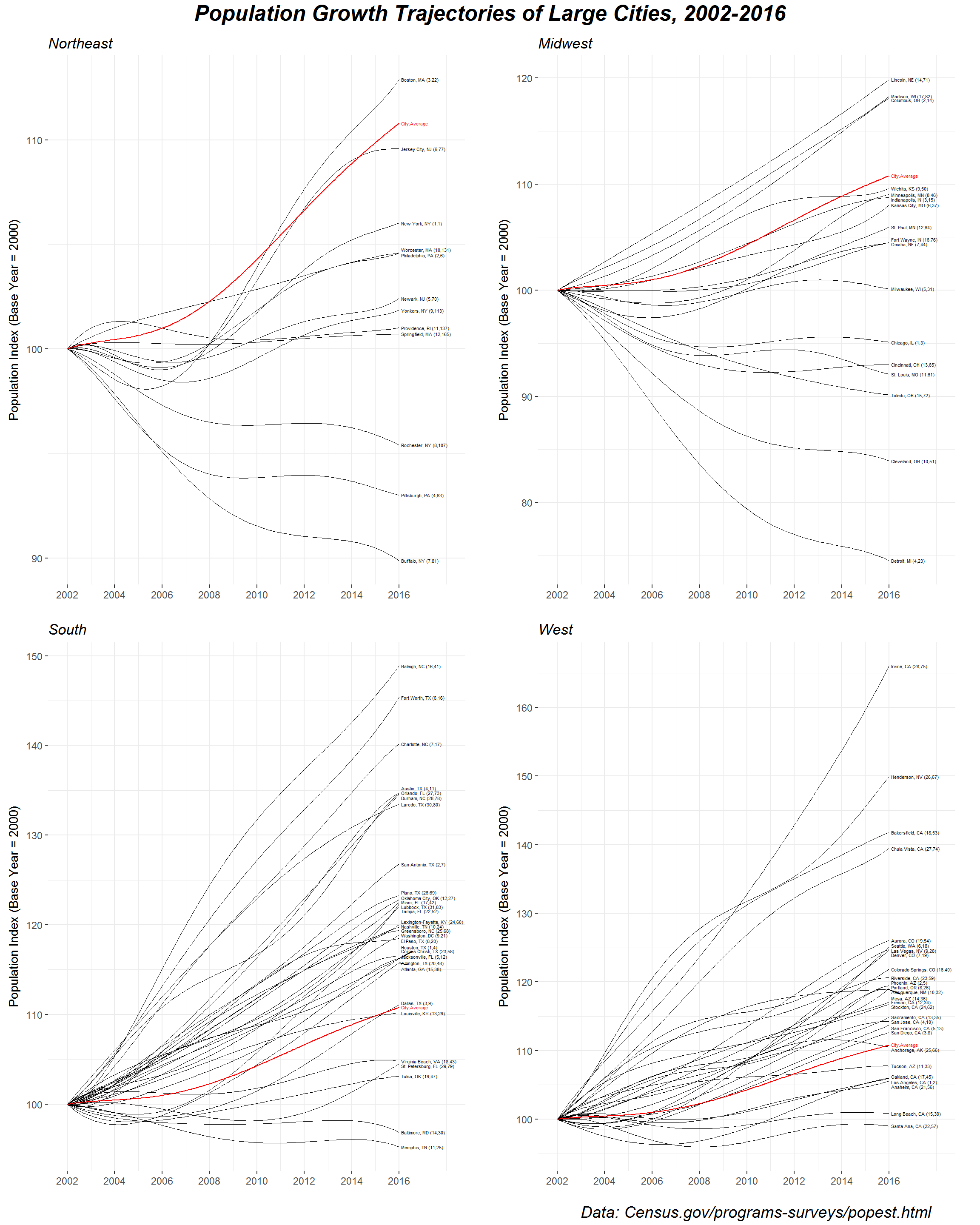
(You can right-click and “open in new tab” to magnify the image.)
It’s nice to be able to see the full population trajectories—for example, we can see that Boston experienced negative growth in the years following 2002 but reversed course to become the Northeast’s fastest-growing large city over the past decade. One of the immediate takeaways, however, is that the most impressive growth is concentrated in the South and the West, led by the likes of Raleigh, NC, Forth Worth, TX, Irvine, CA, and Henderson, NV. (I’m reminded of this article.) By contrast, a number of large cities in the Rust Belt have suffered significant population declines.
I’ll end with a few notes of caution regarding interpretation. The choice of 2002 as the base year is arbitrary (I chose it so that the range would be 15 years), so take the ordering of the labels with a grain of salt. Moreover, today’s fastest-growing cities are not necessarily those highest on the y-scale, but rather those with the largest slopes at \(x = 2016\) (roughly) which, as I’ve already argued, can be misleading with polynomial smoothing. Finally, and perhaps most importantly, it’s worth paying attention to how city geographies are defined—I’ve completely glossed over this, but it’s not at all obvious how to determine boundaries when measuring population. The “incorporated places” that I’ve analyzed here frequently do not conform with the colloquial definitions of those places that people are familiar with.
Addenda
The Wall Street Journal produced a similar graphic for an excellent article about Sioux Falls, SD earlier this year. Oddly, I wasn’t able to locate any population data from the Bureau of Economic Analysis, which is listed as the data source. I did, however, find BEA data on GDP by MSA which looks interesting.
I originally made this visualization using Metropolitan Statistical Areas (MSAs), each of which comprises an urban center in addition to outlying counties. They’re much too large to be called cities so I ended up revising my work (which actually simplified the data munging quite a bit). But the original code and graphic are available here and here. For posterity or something.
Here’s a joyplot of growth densities by year, for all cities that cleared our quarter-million population hurdle. Tails are truncated by the
rel_min_heightargument.
library(ggridges)

city00.16[, .(YEAR=YEAR[-1], g=100*diff(log(POP_Idx))), by='City'] %>%
  ggplot(aes(x = g, y = factor(YEAR, levels=2016:2001))) +
  geom_density_ridges(rel_min_height=.01, fill='royalblue', alpha=.5) +
  scale_x_continuous(limits=c(-3 ,6)) +
  labs(x='YoY population growth (%)', y='') +
  theme_bw() +
  theme(panel.border=element_rect(color=NA))
## Picking joint bandwidth of 0.373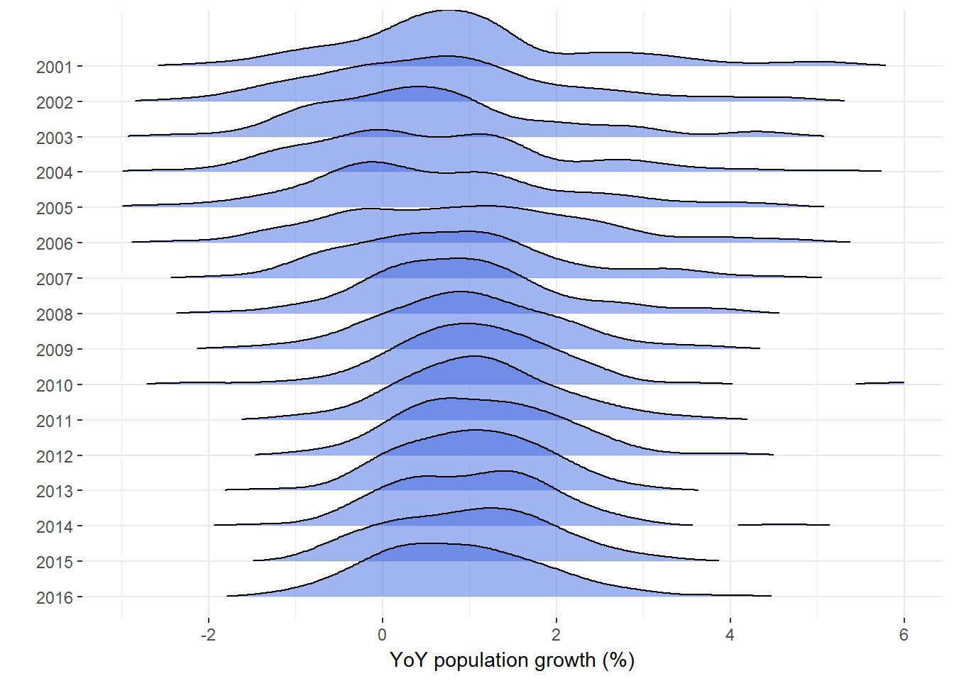
https://www.census.gov/content/dam/Census/data/developers/understandingplace.pdf↩
See here for the API documentation. The data may also be downloaded from Population and Housing Unit Estimates.↩
https://www2.census.gov/geo/pdfs/maps-data/maps/reference/us_regdiv.pdf↩
\(popidx_j\), \(year_j\) and \(\boldsymbol{\varepsilon}_j\) are length-14 column vectors, \(\boldsymbol{\beta}_j\) is a length-5 column vector, and \(\text{poly}(\cdot, 5)\) produces a 14 x 5 matrix.↩